Poll
Logo could be a stylized skillet
If you start fabricating you can put an animal in the skillet (e.g. fish, squid, chicken) and the resulting bikes would be the Fry'd Fish, Fry'd Calamari, Fry'd Chicken...
With bacon
mitt
that's awesome
here is one that i came up with... not sure how much i really like it.
(http://img.photobucket.com/albums/v636/Deadmr2/Logos/FRY-LOGO1.jpg)
or perhaps i should stick with the one i've already done on the girlfriend's bike?
(http://img.photobucket.com/albums/v636/Deadmr2/Logos/NewImage.jpg)
yup
it's the leg on the "R" and the border of the circle
Hurry up and get big, so I can come work for you :P [laugh]
i'm tryin' i'm tryin'!!!
You can see where I am going with this - this is just a quick mockup of the idea. You'd need to play with colors and font.
For a simpler logo, you could just remove the words.
(http://i293.photobucket.com/albums/mm47/roy-nexus-6/LOGOJPG-1.jpg)
it will be a brown bike
...and the seat will have a black edge with a tan middle section
Oversized seat with a frayed rope piping. ;)
and a "lute" or "harp" rack...(surfboard)
Wouldn't it be RE-Fryd Cycles?
I like this one. Where's the survey?
[thumbsup]
When you decide on a logo and you want a trick one for yourself, contact Jen Green. She makes some very nice Headbadges.
www.headbadges.com (http://www.headbadges.com)
i have a few more designs i'd like to try / see (from you guys) then i'll start up a survey
thanks! that was something i was looking into
Me too.
precisely my thoughts! and i'm wearing my tinfoil hat. how did you do that?
stealing Stella's quotes from earlier...
match up the arcs in the letters in this to mimic the circle of the logo with the up/down spires would help...they're going in different directions and fighting each other.
Ding Ding Ding Ding Ding!! Nailed it! [thumbsup]
(http://www.chicagoreader.com/features/stories/oysterwhisperer/oyster1.jpg)
good input.
honestly, i don't know what 'style' of bike i will be creating. To start with, it will be refurbs/repaints and hopefully develop into fabricating my own
i have a few designs in my head (cruiser, road, etc.) so what i'm thinking is this will be the generic 'FRY-Cycles' logo, and i can change what's on the head-tube to match.
My vote. Perfection [thumbsup]
nope
trial by fire ;)
there will be an investment for sure (hence not doing it just yet), but you can do a lot via old fashioned ways...
i do have a soft spot for those old wicker lugs [cheeky]
Maybe the winning designer gets a bike for compensation?
Yeah-start building nice bikes, then worry about the logo. ;)
I hate the blue one. ;D
+1 ;D
Hey! Who you callin' a seat?
[laugh]
honestly i couldn't tell you
i've been trying to figure it out
he said he got it from 'FRY' but i don't see how [laugh]
Yeah, just as i was about to say. Flip it and also get rid of the top curl on one side so it's f and r instead of two f's.
the original ones?
i got rid of them due to low votes / personal appeal
Question: Which one works best for the overall logo of a *custom* bicycle company?
Option 1: New Logo 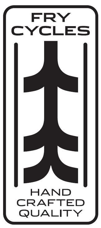
Option 2: plain logo 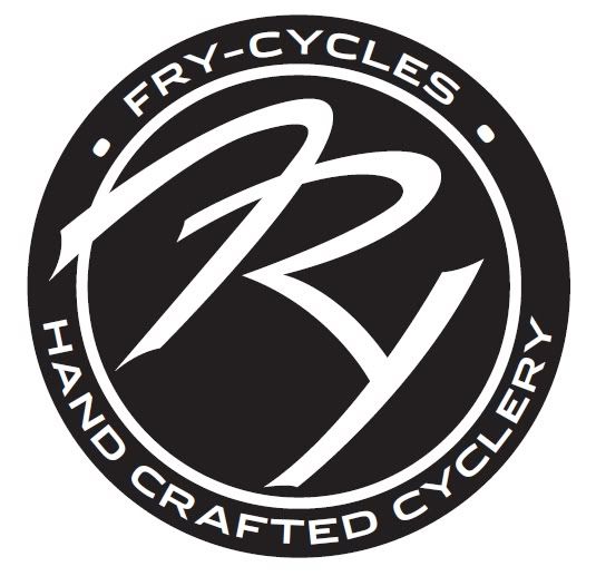
Option 3: Silver Badge 
Title: Design my Logo **Updated with new design**
Post by: MrFryMoto on November 24, 2008, 05:02:53 PM
Post by: MrFryMoto on November 24, 2008, 05:02:53 PM
So, i've decided to start a small bicycle repair/refurb/fabricate (eventually) side business - and i've come up with several logos, but am not completely sold on any of them
this will be the logo that i use on all the steering stems of the bikes
Company name so far: "FRY-Cycles"
if you can think of a better name - throw that in there too
this will be the logo that i use on all the steering stems of the bikes
Company name so far: "FRY-Cycles"
if you can think of a better name - throw that in there too
Title: Re: Design my Logo
Post by: Stella on November 24, 2008, 05:29:13 PM
Post by: Stella on November 24, 2008, 05:29:13 PM
Frycles
;D
;D
Title: Re: Design my Logo
Post by: Kopfjäger on November 24, 2008, 05:41:37 PM
Post by: Kopfjäger on November 24, 2008, 05:41:37 PM
Don't you mean, Head Tube?
Title: Re: Design my Logo
Post by: Big Troubled Bear on November 25, 2008, 12:12:38 AM
Post by: Big Troubled Bear on November 25, 2008, 12:12:38 AM
I don`t see any logo`s Fricycle ;D
Title: Re: Design my Logo
Post by: mitt on November 25, 2008, 06:44:11 AM
Post by: mitt on November 25, 2008, 06:44:11 AM
How about "Fried Cycles" or "Fry'd Cycles"
(https://farm4.static.flickr.com/3289/3059031848_cb10c353d3_o.jpg)
mitt
(https://farm4.static.flickr.com/3289/3059031848_cb10c353d3_o.jpg)
mitt
Title: Re: Design my Logo
Post by: DCXCV on November 25, 2008, 07:42:36 AM
Post by: DCXCV on November 25, 2008, 07:42:36 AM
Quote from: mitt on November 25, 2008, 06:44:11 AM
How about "Fried Cycles" or "Fry'd Cycles"
Logo could be a stylized skillet
If you start fabricating you can put an animal in the skillet (e.g. fish, squid, chicken) and the resulting bikes would be the Fry'd Fish, Fry'd Calamari, Fry'd Chicken...
Title: Re: Design my Logo
Post by: Bun-bun on November 25, 2008, 07:59:54 AM
Post by: Bun-bun on November 25, 2008, 07:59:54 AM
Fry pan with a wire wheel in the round part of the pan.
(I have no art skillz)
(I have no art skillz)
Title: Re: Design my Logo
Post by: mitt on November 25, 2008, 08:03:48 AM
Post by: mitt on November 25, 2008, 08:03:48 AM
Quote from: Bun-bun on November 25, 2008, 07:59:54 AM
Fry pan with a wire wheel in the round part of the pan.
(I have no art skillz)
With bacon
mitt
Title: Re: Design my Logo
Post by: MrFryMoto on November 25, 2008, 12:44:22 PM
Post by: MrFryMoto on November 25, 2008, 12:44:22 PM
Quote from: mitt on November 25, 2008, 06:44:11 AM[laugh] [laugh]
How about "Fried Cycles" or "Fry'd Cycles"
(https://farm4.static.flickr.com/3289/3059031848_cb10c353d3_o.jpg)
mitt
that's awesome
here is one that i came up with... not sure how much i really like it.
(http://img.photobucket.com/albums/v636/Deadmr2/Logos/FRY-LOGO1.jpg)
or perhaps i should stick with the one i've already done on the girlfriend's bike?
(http://img.photobucket.com/albums/v636/Deadmr2/Logos/NewImage.jpg)
Title: Re: Design my Logo
Post by: Fresh Pants on November 25, 2008, 12:50:05 PM
Post by: Fresh Pants on November 25, 2008, 12:50:05 PM
I like it, is there a "Y" in that logo?
Fixin' bikecycles is fun.
Fixin' bikecycles is fun.
Title: Re: Design my Logo
Post by: flanman on November 25, 2008, 12:51:46 PM
Post by: flanman on November 25, 2008, 12:51:46 PM
Could be an onion ring resembling a bike tire. ;D
Title: Re: Design my Logo
Post by: MrFryMoto on November 25, 2008, 01:12:08 PM
Post by: MrFryMoto on November 25, 2008, 01:12:08 PM
Quote from: Fresh Pants on November 25, 2008, 12:50:05 PM
I like it, is there a "Y" in that logo?
Fixin' bikecycles is fun.
yup
it's the leg on the "R" and the border of the circle
Title: Re: Design my Logo
Post by: TiAvenger on November 25, 2008, 01:13:03 PM
Post by: TiAvenger on November 25, 2008, 01:13:03 PM
Quote from: MrFry on November 25, 2008, 01:12:08 PM
yup
it's the leg on the "R" and the border of the circle
Hurry up and get big, so I can come work for you :P [laugh]
Title: Re: Design my Logo
Post by: MrFryMoto on November 25, 2008, 01:15:20 PM
Post by: MrFryMoto on November 25, 2008, 01:15:20 PM
Quote from: Court-Jester on November 25, 2008, 01:13:03 PM
Hurry up and get big, so I can come work for you :P [laugh]
i'm tryin' i'm tryin'!!!
Title: Re: Design my Logo
Post by: TiAvenger on November 25, 2008, 01:18:24 PM
Post by: TiAvenger on November 25, 2008, 01:18:24 PM
You have to name one of the designs/ lines....
FRY-er Tuck.
;D [laugh]
FRY-er Tuck.
;D [laugh]
Title: Re: Design my Logo
Post by: roy-nexus-6 on November 25, 2008, 04:15:10 PM
Post by: roy-nexus-6 on November 25, 2008, 04:15:10 PM
Quote from: MrFry on November 24, 2008, 05:02:53 PM
So, i've decided to start a small bicycle repair/refurb/fabricate (eventually) side business - and i've come up with several logos, but am not completely sold on any of them
this will be the logo that i use on all the steering stems of the bikes
Company name so far: "FRY-Cycles"
if you can think of a better name - throw that in there too
You can see where I am going with this - this is just a quick mockup of the idea. You'd need to play with colors and font.
For a simpler logo, you could just remove the words.
(http://i293.photobucket.com/albums/mm47/roy-nexus-6/LOGOJPG-1.jpg)
Title: Re: Design my Logo
Post by: MrFryMoto on November 25, 2008, 05:07:03 PM
Post by: MrFryMoto on November 25, 2008, 05:07:03 PM
Quote from: Court-Jester on November 25, 2008, 01:18:24 PM
You have to name one of the designs/ lines....
FRY-er Tuck.
;D [laugh]
it will be a brown bike
...and the seat will have a black edge with a tan middle section
Title: Re: Design my Logo
Post by: TiAvenger on November 25, 2008, 05:24:34 PM
Post by: TiAvenger on November 25, 2008, 05:24:34 PM
Quote from: MrFry on November 25, 2008, 05:07:03 PM
it will be a brown bike
...and the seat will have a black edge with a tan middle section
Oversized seat with a frayed rope piping. ;)
and a "lute" or "harp" rack...(surfboard)
Title: Re: Design my Logo
Post by: red baron on November 25, 2008, 08:14:24 PM
Post by: red baron on November 25, 2008, 08:14:24 PM
Quote from: mitt on November 25, 2008, 06:44:11 AM
How about "Fried Cycles" or "Fry'd Cycles"
(https://farm4.static.flickr.com/3289/3059031848_cb10c353d3_o.jpg)
mitt
Wouldn't it be RE-Fryd Cycles?
Title: Re: Design my Logo
Post by: eltristo on November 25, 2008, 10:19:22 PM
Post by: eltristo on November 25, 2008, 10:19:22 PM
I actually like what you did on the head tube, only bring the space that makes the right side of the Y up to be in line with the F and R.
I have spoken, make it so! [cheeky]
I have spoken, make it so! [cheeky]
Title: Re: Design my Logo
Post by: supakpow2 on November 25, 2008, 11:36:22 PM
Post by: supakpow2 on November 25, 2008, 11:36:22 PM
Here is a cool one that I saw somewhere.
(http://i320.photobucket.com/albums/nn327/supakpow/357449943_ef8fa0a85d-1.jpg)
just flip the "wheels" the other way and I could see them being F and C
(http://i320.photobucket.com/albums/nn327/supakpow/357449943_ef8fa0a8.jpg)
(http://i320.photobucket.com/albums/nn327/supakpow/357449943_ef8fa0a85d-1.jpg)
just flip the "wheels" the other way and I could see them being F and C
(http://i320.photobucket.com/albums/nn327/supakpow/357449943_ef8fa0a8.jpg)
Title: Re: Design my Logo
Post by: MrFryMoto on November 26, 2008, 12:41:07 PM
Post by: MrFryMoto on November 26, 2008, 12:41:07 PM
i keep leaning towards the original logo design - i refined it a bit in here (or at least the center of it), the lines aren't perfect, but it's the best thing i can do with the resources i have here at work.
whadya tink?
(http://img.photobucket.com/albums/v636/Deadmr2/Logos/lgonew2.jpg)
whadya tink?
(http://img.photobucket.com/albums/v636/Deadmr2/Logos/lgonew2.jpg)
Title: Re: Design my Logo
Post by: MrFryMoto on November 26, 2008, 01:08:50 PM
Post by: MrFryMoto on November 26, 2008, 01:08:50 PM
couple more:
(http://img.photobucket.com/albums/v636/Deadmr2/Logos/logcomb.jpg)
(http://img.photobucket.com/albums/v636/Deadmr2/Logos/logcomb2.jpg)
the white would be the bicycle color
(http://img.photobucket.com/albums/v636/Deadmr2/Logos/BLOCKLOGO.jpg)
yay, nay?
(http://img.photobucket.com/albums/v636/Deadmr2/Logos/logcomb.jpg)
(http://img.photobucket.com/albums/v636/Deadmr2/Logos/logcomb2.jpg)
the white would be the bicycle color
(http://img.photobucket.com/albums/v636/Deadmr2/Logos/BLOCKLOGO.jpg)
yay, nay?
Title: Re: Design my Logo
Post by: TiAvenger on November 26, 2008, 01:47:42 PM
Post by: TiAvenger on November 26, 2008, 01:47:42 PM
The first
[thumbsup]
[thumbsup]
Title: Re: Design my Logo
Post by: eltristo on November 26, 2008, 01:58:20 PM
Post by: eltristo on November 26, 2008, 01:58:20 PM
Quote from: MrFry on November 26, 2008, 01:08:50 PM
couple more:
(http://img.photobucket.com/albums/v636/Deadmr2/Logos/logcomb.jpg)
yay, nay?
I like this one. Where's the survey?
Title: Re: Design my Logo
Post by: Kopfjäger on November 26, 2008, 02:04:31 PM
Post by: Kopfjäger on November 26, 2008, 02:04:31 PM
Quote from: MrFry on November 26, 2008, 01:08:50 PM
(http://img.photobucket.com/albums/v636/Deadmr2/Logos/BLOCKLOGO.jpg)
[thumbsup]
When you decide on a logo and you want a trick one for yourself, contact Jen Green. She makes some very nice Headbadges.
www.headbadges.com (http://www.headbadges.com)
Title: Re: Design my Logo
Post by: MrFryMoto on November 26, 2008, 02:44:50 PM
Post by: MrFryMoto on November 26, 2008, 02:44:50 PM
Quote from: elTristo on November 26, 2008, 01:58:20 PM
I like this one. Where's the survey?
i have a few more designs i'd like to try / see (from you guys) then i'll start up a survey
Quote from: kopfjager on November 26, 2008, 02:04:31 PM
[thumbsup]
When you decide on a logo and you want a trick one for yourself, contact Jen Green. She makes some very nice Headbadges.
www.headbadges.com (http://www.headbadges.com)
thanks! that was something i was looking into
Title: Re: Design my Logo
Post by: Howie on November 26, 2008, 08:24:14 PM
Post by: Howie on November 26, 2008, 08:24:14 PM
Quote from: elTristo on November 26, 2008, 01:58:20 PM
I like this one. Where's the survey?
Me too.
Title: Re: Design my Logo
Post by: MrFryMoto on November 28, 2008, 10:54:31 AM
Post by: MrFryMoto on November 28, 2008, 10:54:31 AM
(http://img.photobucket.com/albums/v636/Deadmr2/Logos/emblem1.jpg)
thinking about getting emblems made (or making) similar to this
the dark grey would be black
thinking about getting emblems made (or making) similar to this
the dark grey would be black
Title: Re: Design my Logo
Post by: Howie on November 28, 2008, 03:30:53 PM
Post by: Howie on November 28, 2008, 03:30:53 PM
[thumbsup]
Title: Re: Design my Logo
Post by: eltristo on November 28, 2008, 05:16:40 PM
Post by: eltristo on November 28, 2008, 05:16:40 PM
Quote from: howie on November 28, 2008, 03:30:53 PM[thumbsup] [thumbsup]
[thumbsup]
Title: Re: Design my Logo
Post by: MrFryMoto on November 29, 2008, 07:04:48 PM
Post by: MrFryMoto on November 29, 2008, 07:04:48 PM
hmmm i'm still not completely sold on any of them as of yet
i really need to get my computer working so that i can do some graphic/CAD intensive work
....that being said, FRY-CYCLE #2 is in the garage ready and waiting ;)
i really need to get my computer working so that i can do some graphic/CAD intensive work
....that being said, FRY-CYCLE #2 is in the garage ready and waiting ;)
Title: Re: Design my Logo
Post by: Kopfjäger on November 29, 2008, 07:17:43 PM
Post by: Kopfjäger on November 29, 2008, 07:17:43 PM
^^^^ Take your time. The right one will jump out at you when you see it. ;)
Title: Re: Design my Logo
Post by: MrFryMoto on November 29, 2008, 09:53:44 PM
Post by: MrFryMoto on November 29, 2008, 09:53:44 PM
(http://img.photobucket.com/albums/v636/Deadmr2/Logos/FRYBlockLogo1.jpg)
(http://img.photobucket.com/albums/v636/Deadmr2/Logos/FRYLogo2.jpg)
(http://img.photobucket.com/albums/v636/Deadmr2/Logos/FRYLogo3.jpg)
wow... the scan makes my hand drawings look like hell
either way - you get the idea
gear?
block logo?
(http://img.photobucket.com/albums/v636/Deadmr2/Logos/FRYLogo2.jpg)
(http://img.photobucket.com/albums/v636/Deadmr2/Logos/FRYLogo3.jpg)
wow... the scan makes my hand drawings look like hell
either way - you get the idea
gear?
block logo?
Title: Re: Design my Logo
Post by: CapnCrunch on November 30, 2008, 12:09:02 AM
Post by: CapnCrunch on November 30, 2008, 12:09:02 AM
you should make a bike out of french fries
Title: Re: Design my Logo
Post by: eltristo on November 30, 2008, 09:37:24 AM
Post by: eltristo on November 30, 2008, 09:37:24 AM
The gear logo looks good, but it kinda has that "i've seen this before" feel to it.
I still like
with just a little cleanup on the way the letters fit.
really i guess it's the lettering i like. though i can easily picture the pointy one in metal. and pointy is cool [thumbsup]
I still like
Quote from: MrFry on November 28, 2008, 10:54:31 AM
(http://img.photobucket.com/albums/v636/Deadmr2/Logos/emblem1.jpg)
with just a little cleanup on the way the letters fit.
really i guess it's the lettering i like. though i can easily picture the pointy one in metal. and pointy is cool [thumbsup]
Title: Re: Design my Logo
Post by: the_Journeyman on November 30, 2008, 09:47:19 AM
Post by: the_Journeyman on November 30, 2008, 09:47:19 AM
Let me add about the clean-up Tristo mentioned:
Curve the top of the F to match the curve of the circle, same with the right-most part of the Y
JM
Curve the top of the F to match the curve of the circle, same with the right-most part of the Y
JM
Title: Re: Design my Logo
Post by: eltristo on November 30, 2008, 01:07:20 PM
Post by: eltristo on November 30, 2008, 01:07:20 PM
Quote from: the_Journeyman on November 30, 2008, 09:47:19 AM
Let me add about the clean-up Tristo mentioned:
Curve the top of the F to match the curve of the circle, same with the right-most part of the Y
JM
precisely my thoughts! and i'm wearing my tinfoil hat. how did you do that?
Title: Re: Design my Logo
Post by: ducpainter on November 30, 2008, 01:08:30 PM
Post by: ducpainter on November 30, 2008, 01:08:30 PM
Quote from: elTristo on November 30, 2008, 01:07:20 PMYou must have it on inside out.... :P
precisely my thoughts! and i'm wearing my tinfoil hat. how did you do that?
Title: Re: Design my Logo
Post by: MrFryMoto on November 30, 2008, 10:10:18 PM
Post by: MrFryMoto on November 30, 2008, 10:10:18 PM
(http://img.photobucket.com/albums/v636/Deadmr2/Logos/SCRIPT.jpg)
(http://img.photobucket.com/albums/v636/Deadmr2/Logos/FRYCYCLE5.jpg)
(http://img.photobucket.com/albums/v636/Deadmr2/Logos/FRY-temp2.jpg)
(http://img.photobucket.com/albums/v636/Deadmr2/Logos/FRY3.jpg)
(http://img.photobucket.com/albums/v636/Deadmr2/Logos/FRYCYCLE5.jpg)
(http://img.photobucket.com/albums/v636/Deadmr2/Logos/FRY-temp2.jpg)
(http://img.photobucket.com/albums/v636/Deadmr2/Logos/FRY3.jpg)
Title: Re: Design my Logo
Post by: Randimus Maximus on November 30, 2008, 10:17:02 PM
Post by: Randimus Maximus on November 30, 2008, 10:17:02 PM
Quote from: MrFry on November 29, 2008, 09:53:44 PM
(http://img.photobucket.com/albums/v636/Deadmr2/Logos/FRYLogo2.jpg)
stealing Stella's quotes from earlier...
match up the arcs in the letters in this to mimic the circle of the logo with the up/down spires would help...they're going in different directions and fighting each other.
Title: Re: Design my Logo
Post by: MrFryMoto on December 01, 2008, 01:08:24 PM
Post by: MrFryMoto on December 01, 2008, 01:08:24 PM
not sure if i did this how you guys/gals are visualizing (please feel free to help me out here)
(http://img.photobucket.com/albums/v636/Deadmr2/Logos/newlog.jpg)
(http://img.photobucket.com/albums/v636/Deadmr2/Logos/newlogcolor.jpg)
(http://img.photobucket.com/albums/v636/Deadmr2/Logos/newlog.jpg)
(http://img.photobucket.com/albums/v636/Deadmr2/Logos/newlogcolor.jpg)
Title: Re: Design my Logo
Post by: eltristo on December 01, 2008, 01:26:50 PM
Post by: eltristo on December 01, 2008, 01:26:50 PM
definitely better [thumbsup]
what if either the lettering were to rotate ever-so-slightly counterclockwise, or the background bit were to rotate that same distance clockwise? essentially what i think i'm looking for is tor the f and y to follow the curve without needing to extend quite so far.
though i do think i like the letters extended slightly.
confusing enough? i think i gave myself a headache [cheeky]
Title: Re: Design my Logo
Post by: MrFryMoto on December 01, 2008, 06:04:14 PM
Post by: MrFryMoto on December 01, 2008, 06:04:14 PM
(http://img.photobucket.com/albums/v636/Deadmr2/Logos/newlog2.jpg)
Title: Re: Design my Logo
Post by: eltristo on December 01, 2008, 06:49:10 PM
Post by: eltristo on December 01, 2008, 06:49:10 PM
me likey!
now do it in gray-n-black, and the world will be your oyster.
i hope you like oysters ;D
now do it in gray-n-black, and the world will be your oyster.
i hope you like oysters ;D
Title: Re: Design my Logo
Post by: MrFryMoto on December 01, 2008, 08:22:05 PM
Post by: MrFryMoto on December 01, 2008, 08:22:05 PM
(http://img.photobucket.com/albums/v636/Deadmr2/Logos/newlog2color.jpg)
no where's me oysters?!
no where's me oysters?!
Title: Re: Design my Logo
Post by: eltristo on December 02, 2008, 12:02:02 AM
Post by: eltristo on December 02, 2008, 12:02:02 AM
Oh god! I think I've soiled myself!
( [thumbsup])
( [thumbsup])
Title: Re: Design my Logo
Post by: Oldfisti on December 02, 2008, 03:35:09 AM
Post by: Oldfisti on December 02, 2008, 03:35:09 AM
Quote from: MrFry on December 01, 2008, 08:22:05 PM
(http://img.photobucket.com/albums/v636/Deadmr2/Logos/newlog2color.jpg)
no where's me oysters?!
Ding Ding Ding Ding Ding!! Nailed it! [thumbsup]
(http://www.chicagoreader.com/features/stories/oysterwhisperer/oyster1.jpg)
Title: Re: Design my Logo
Post by: MrFryMoto on December 02, 2008, 11:40:04 AM
Post by: MrFryMoto on December 02, 2008, 11:40:04 AM
poll bump
Title: Re: Design my Logo
Post by: Jarvicious on December 02, 2008, 12:39:08 PM
Post by: Jarvicious on December 02, 2008, 12:39:08 PM
Looks good! I kinda liked the previous "pointy" emblem that had the two upper and lower triangles disconnected from the middle oval shape. It gave it a bit more depth and seemed to give my eyes juuuuust a bit more to look at. Have you thought about maybe exaggerating the flares on the letters a bit more? They look a bit skinny.
What kind of frames are you going to be building? I think the style of bike you make should have a big influence on your logo design. Take Independent Fabrication for example. Their framesets are pretty basic and geometric with standard round tubing and fairly dated geometry. For that reason, their logo is just their name in a very basic geometric font and it seems bo match the overall aesthetic of the bike pretty well. On the other hand, if you look at Rivendell's framesets they have much more fluid lines as well as lugged joints and their head tube logo is definitely suited to match. Point is, don't create a really pointy and geometric logo if you're going to be building a beach cruiser that doesn't have a straight line on it.
Wow, does that all sound critical :). I don't mean to sound snooty, just figured I'd throw down my $.02. I like the progression though. It's coming along nicely.
Title: Re: Design my Logo
Post by: MrFryMoto on December 02, 2008, 12:45:28 PM
Post by: MrFryMoto on December 02, 2008, 12:45:28 PM
Quote from: Jarvicious on December 02, 2008, 12:39:08 PM
Looks good! I kinda liked the previous "pointy" emblem that had the two upper and lower triangles disconnected from the middle oval shape. It gave it a bit more depth and seemed to give my eyes juuuuust a bit more to look at. Have you thought about maybe exaggerating the flares on the letters a bit more? They look a bit skinny.
What kind of frames are you going to be building? I think the style of bike you make should have a big influence on your logo design. Take Independent Fabrication for example. Their framesets are pretty basic and geometric with standard round tubing and fairly dated geometry. For that reason, their logo is just their name in a very basic geometric font and it seems bo match the overall aesthetic of the bike pretty well. On the other hand, if you look at Rivendell's framesets they have much more fluid lines as well as lugged joints and their head tube logo is definitely suited to match. Point is, don't create a really pointy and geometric logo if you're going to be building a beach cruiser that doesn't have a straight line on it.
Wow, does that all sound critical :). I don't mean to sound snooty, just figured I'd throw down my $.02. I like the progression though. It's coming along nicely.
good input.
honestly, i don't know what 'style' of bike i will be creating. To start with, it will be refurbs/repaints and hopefully develop into fabricating my own
i have a few designs in my head (cruiser, road, etc.) so what i'm thinking is this will be the generic 'FRY-Cycles' logo, and i can change what's on the head-tube to match.
Title: Re: Design my Logo
Post by: eltristo on December 02, 2008, 01:26:44 PM
Post by: eltristo on December 02, 2008, 01:26:44 PM
have you studied frame building yet? if not, plan to? i've been wanting to make the jump for years, but i just can't justify the expense yet, esp. since i really don't have the space for a shop.
anyhoo, good luck!
anyhoo, good luck!
Title: Re: Design my Logo
Post by: Howie on December 02, 2008, 02:37:06 PM
Post by: Howie on December 02, 2008, 02:37:06 PM
Quote from: MrFry on December 01, 2008, 08:22:05 PM
(http://img.photobucket.com/albums/v636/Deadmr2/Logos/newlog2color.jpg)
no where's me oysters?!
My vote. Perfection [thumbsup]
Title: Re: Design my Logo
Post by: MrFryMoto on December 02, 2008, 03:01:38 PM
Post by: MrFryMoto on December 02, 2008, 03:01:38 PM
Quote from: elTristo on December 02, 2008, 01:26:44 PM
have you studied frame building yet? if not, plan to? i've been wanting to make the jump for years, but i just can't justify the expense yet, esp. since i really don't have the space for a shop.
anyhoo, good luck!
nope
trial by fire ;)
there will be an investment for sure (hence not doing it just yet), but you can do a lot via old fashioned ways...
Title: Re: Design my Logo
Post by: eltristo on December 02, 2008, 04:01:58 PM
Post by: eltristo on December 02, 2008, 04:01:58 PM
Quote from: MrFry on December 02, 2008, 03:01:38 PM
nope
trial by fire ;)
there will be an investment for sure (hence not doing it just yet), but you can do a lot via old fashioned ways...
i do have a soft spot for those old wicker lugs [cheeky]
Title: Re: Design my Logo
Post by: MrFryMoto on December 09, 2008, 12:19:31 PM
Post by: MrFryMoto on December 09, 2008, 12:19:31 PM
Just an update:
late last night i put an ad on Craigslist saying i am looking for someone to design the logo for me
this morning i had about 13 emails from local students (and a couple from graphic design firms) saying they would like to do this.
i'm picking a few to see what they come up with
any idea what a fair compensation would be for these people, or is just the fact they can put this in a portfolio enough?
Title: Re: Design my Logo
Post by: the_Journeyman on December 09, 2008, 12:21:36 PM
Post by: the_Journeyman on December 09, 2008, 12:21:36 PM
If you can find a student to do it, it's excellent for their starting portfolio, but I would still think some type of compensation would be greatly appreciated. I just have no idea how much ~
JM
JM
Title: Re: Design my Logo
Post by: TiAvenger on December 09, 2008, 12:28:30 PM
Post by: TiAvenger on December 09, 2008, 12:28:30 PM
Quote from: MrFry on December 09, 2008, 12:19:31 PM
Just an update:
late last night i put an ad on Craigslist saying i am looking for someone to design the logo for me
this morning i had about 13 emails from local students (and a couple from graphic design firms) saying they would like to do this.
i'm picking a few to see what they come up with
any idea what a fair compensation would be for these people, or is just the fact they can put this in a portfolio enough?
Maybe the winning designer gets a bike for compensation?
Title: Re: Design my Logo
Post by: Slag on December 09, 2008, 12:47:07 PM
Post by: Slag on December 09, 2008, 12:47:07 PM
We used a graphic arts student to do a small business logo. She did a fantastic job, and we paid her $500.
Title: Re: Design my Logo
Post by: eltristo on December 09, 2008, 11:37:32 PM
Post by: eltristo on December 09, 2008, 11:37:32 PM
eep. i was thinking closer to $100. oops.
Title: Re: Design my Logo
Post by: MrFryMoto on May 21, 2009, 08:43:07 AM
Post by: MrFryMoto on May 21, 2009, 08:43:07 AM
New Designs - any input/suggestions?
(http://img.photobucket.com/albums/v636/Deadmr2/Logos/FRY-CYCLESlogo.jpg)
(http://img.photobucket.com/albums/v636/Deadmr2/Logos/FRY-CYCLESlogoblack.jpg)
(http://img.photobucket.com/albums/v636/Deadmr2/Logos/FRY-CYCLESlogoblue.jpg)
(http://img.photobucket.com/albums/v636/Deadmr2/Logos/FRY-CYCLESlogo.jpg)
(http://img.photobucket.com/albums/v636/Deadmr2/Logos/FRY-CYCLESlogoblack.jpg)
(http://img.photobucket.com/albums/v636/Deadmr2/Logos/FRY-CYCLESlogoblue.jpg)
Title: Re: Design my Logo
Post by: Popeye the Sailor on May 21, 2009, 11:49:22 AM
Post by: Popeye the Sailor on May 21, 2009, 11:49:22 AM
Quote from: MrFry - Cycles on May 21, 2009, 08:43:07 AM
New Designs - any input/suggestions?
Yeah-start building nice bikes, then worry about the logo. ;)
Title: Re: Design my Logo **Updated with new design**
Post by: Oldfisti on May 21, 2009, 12:50:41 PM
Post by: Oldfisti on May 21, 2009, 12:50:41 PM
I like the blue one [thumbsup]
Title: Re: Design my Logo **Updated with new design**
Post by: ducpainter on May 21, 2009, 06:07:23 PM
Post by: ducpainter on May 21, 2009, 06:07:23 PM
Quote from: alfisti on May 21, 2009, 12:50:41 PMWhich proves there is an ass for every seat...
I like the blue one [thumbsup]
I hate the blue one. ;D
Title: Re: Design my Logo **Updated with new design**
Post by: NAKID on May 21, 2009, 06:29:23 PM
Post by: NAKID on May 21, 2009, 06:29:23 PM
I voted for the first one. It looks like a classic 50's style bicycle manufacturer...
Title: Re: Design my Logo **Updated with new design**
Post by: Kopfjäger on May 21, 2009, 10:50:05 PM
Post by: Kopfjäger on May 21, 2009, 10:50:05 PM
Enough with the logo, let's see some bikes. ;)
Title: Re: Design my Logo **Updated with new design**
Post by: Big Troubled Bear on May 21, 2009, 11:34:01 PM
Post by: Big Troubled Bear on May 21, 2009, 11:34:01 PM
I like the black one, looks classic [thumbsup]
Title: Re: Design my Logo **Updated with new design**
Post by: Mother on May 21, 2009, 11:54:41 PM
Post by: Mother on May 21, 2009, 11:54:41 PM
Frycles
Title: Re: Design my Logo **Updated with new design**
Post by: somegirl on May 22, 2009, 06:02:32 PM
Post by: somegirl on May 22, 2009, 06:02:32 PM
Quote from: kopfjager on May 21, 2009, 10:50:05 PM
Enough with the logo, let's see some bikes. ;)
+1 ;D
Title: Re: Design my Logo **Updated with new design**
Post by: Oldfisti on May 23, 2009, 03:39:41 AM
Post by: Oldfisti on May 23, 2009, 03:39:41 AM
Quote from: ducpainter on May 21, 2009, 06:07:23 PM
Which proves there is an ass for every seat...
I hate the blue one. ;D
Hey! Who you callin' a seat?
[laugh]
Title: Re: Design my Logo **Updated with new design**
Post by: Langanobob on May 23, 2009, 11:31:56 AM
Post by: Langanobob on May 23, 2009, 11:31:56 AM
The logo is stylish, but...if I didn't already know it said Fry I'd never be able to decipher it. I vote for a complete and total re-design to something basic and fundamental and legible :) And something instantly identifiable, costomer recognition and all that. IMHO even some of the car company logo's don't carry brand recognition. You can hardly tell Honda from Hyundai and Toyota's little circled hat is kind of silly.
Title: Re: Design my Logo **Updated with new design**
Post by: MrFryMoto on June 02, 2009, 09:43:05 AM
Post by: MrFryMoto on June 02, 2009, 09:43:05 AM
i've been working with a graphic designer friend of mine on this - he sent me the square version this morning.
he said he pulled the design from "FRY" (not quite sure how)
i like the round logo more but it feels a bit like a surfboard company...
opinions?
...yes, i know i need to start working on the bikes (i am gathering materials right now)
he said he pulled the design from "FRY" (not quite sure how)
i like the round logo more but it feels a bit like a surfboard company...
opinions?
...yes, i know i need to start working on the bikes (i am gathering materials right now)
Title: Re: Design my Logo **Updated with new design**
Post by: stopintime on June 02, 2009, 02:37:50 PM
Post by: stopintime on June 02, 2009, 02:37:50 PM
I think the new design looks more like a modern company. Maybe some work on the lettering to match the fat parts of the logo?
Title: Re: Design my Logo **Updated with new design**
Post by: NAKID on June 02, 2009, 03:03:46 PM
Post by: NAKID on June 02, 2009, 03:03:46 PM
What's the significance behind the new design?
Title: Re: Design my Logo **Updated with new design**
Post by: MrFryMoto on June 02, 2009, 03:30:05 PM
Post by: MrFryMoto on June 02, 2009, 03:30:05 PM
Quote from: NAKID on June 02, 2009, 03:03:46 PM
What's the significance behind the new design?
honestly i couldn't tell you
i've been trying to figure it out
he said he got it from 'FRY' but i don't see how [laugh]
Title: Re: Design my Logo **Updated with new design**
Post by: stopintime on June 02, 2009, 04:00:04 PM
Post by: stopintime on June 02, 2009, 04:00:04 PM
Turn/see it upside down. The "f" is the upper two thirds, the "r" is the middle half and the "y" is the lower third.
Add some mirroring effects and a Designer and it all makes sence?
Me, I would turn it upside down, to get it right - sort of.
Add some mirroring effects and a Designer and it all makes sence?
Me, I would turn it upside down, to get it right - sort of.
Title: Re: Design my Logo **Updated with new design**
Post by: DCXCV on June 02, 2009, 04:13:10 PM
Post by: DCXCV on June 02, 2009, 04:13:10 PM
Quote from: MrFry - Cycles on June 02, 2009, 03:30:05 PM
honestly i couldn't tell you
i've been trying to figure it out
he said he got it from 'FRY' but i don't see how [laugh]
Quote from: stopintime on June 02, 2009, 04:00:04 PM
Turn/see it upside down. The "f" is the upper two thirds, the "r" is the middle half and the "y" is the lower third.
Add some mirroring effects and a Designer and it all makes sence?
Me, I would turn it upside down, to get it right - sort of.
Yeah, just as i was about to say. Flip it and also get rid of the top curl on one side so it's f and r instead of two f's.
Title: Re: Design my Logo **Updated with new design**
Post by: MrFryMoto on June 02, 2009, 05:48:11 PM
Post by: MrFryMoto on June 02, 2009, 05:48:11 PM
hmm, yeah i see it now
still not quite feeling it though :-\
here's some simple photo-shops i had done on the old logo
Silver Badge (https://farm4.static.flickr.com/3305/3590980108_a3ee886df5.jpg?v=0)
Decal (https://farm4.static.flickr.com/3617/3590171375_7e87cac5a8.jpg?v=0)
Chrome Badge (https://farm4.static.flickr.com/3659/3590980262_91d89803ba.jpg?v=0)
Copper Badge (https://farm4.static.flickr.com/3321/3590171227_53ae4a835a.jpg?v=0)
Title: Re: Design my Logo **Updated with new design**
Post by: NAKID on June 02, 2009, 06:23:23 PM
Post by: NAKID on June 02, 2009, 06:23:23 PM
What happened to the old ones?
Title: Re: Design my Logo **Updated with new design**
Post by: MrFryMoto on June 02, 2009, 06:54:06 PM
Post by: MrFryMoto on June 02, 2009, 06:54:06 PM
Quote from: NAKID on June 02, 2009, 06:23:23 PM
What happened to the old ones?
the original ones?
i got rid of them due to low votes / personal appeal
Title: Re: Design my Logo **Updated with new design**
Post by: NAKID on June 02, 2009, 06:55:53 PM
Post by: NAKID on June 02, 2009, 06:55:53 PM
I really liked the old school looking one. Still do. It's the best IMO...
Title: Re: Design my Logo **Updated with new design**
Post by: corey on June 03, 2009, 07:03:20 AM
Post by: corey on June 03, 2009, 07:03:20 AM
mmmm.. hand crafted celery... uhhuhhhh