Jukie
I need a
Hero Member

 Offline Offline
Posts: 7205
Paradise
|
 |
« on: November 25, 2008, 12:52:15 PM » |
|
So what do we think about the new logo  |
|
|
|
« Last Edit: November 25, 2008, 02:39:28 PM by Jukie »
|
 Logged
|
Before Honda CB125N
Suzuki GS125
Now. Ducati 620ie
Lambretta Li150
Ducati S4RT
|
|
|
|
Super T.I.B
Guest
|
|
« Reply #1 on: November 25, 2008, 01:31:19 PM » |
|
So what do we think about the new logo Looks like my Puma shoes. |
|
|
|
|
Logged
|
|
|
|
|
dragonworld.
|
|
« Reply #2 on: November 25, 2008, 02:08:05 PM » |
|
Nuthin' spectacular!!  |
|
|
|
|
Logged
|
Secret to a long relationship is........Keep the fights clean and the sex DIRTY"!
|
|
|
|
mattyvas
|
|
« Reply #3 on: November 25, 2008, 03:04:25 PM » |
|
I hope they have signed a very long term contract with Puma.
Otherwise when they part it will be like separating siamese twins!
|
|
|
|
|
Logged
|
|
|
|
|
Six95
|
|
« Reply #4 on: November 25, 2008, 05:42:44 PM » |
|
When I was in Hawaii a week or so back - I went into the Puma store and spent up big on Ducati clothing, shoes and bags etc. There was so much ducati stuff. The crap dollar kept me from going crazy. Anyway - Puma Ocean Racing has a yacht called "Il Mostro" - Very original  |
|
|
|
|
Logged
|
The sound of Ducati - A symphony of internal combustion
|
|
|
|
techno
|
|
« Reply #5 on: November 25, 2008, 09:38:13 PM » |
|
Its a bit plain.
I think the swoop thing is meant to symbolise a road or something. Surely they recognised that it would be visually linked with Puma.
If the Puma link was on purpose, i think its a bad thing.
|
|
|
|
|
Logged
|
|
|
|
|
loony888
|
|
« Reply #6 on: November 25, 2008, 10:11:54 PM » |
|
it's rather average isn't it? still, better than a circle with a line through it!!! i wish i was a graphic artist or whoever it is that thinks up these lame designs and gets paid a squillion bucks for their effort!
paul.
|
|
|
|
|
Logged
|
HERE AND NOW 12 DIAVEL AMG
93 888 RS
09 1098R BAYLISS
07 Husqvarna TE 450
GONE BUT NOT FORGOTTEN 03 S4R 95 900SL
01 S4 93 900M
96 748SP
|
|
|
|
Super T.I.B
Guest
|
|
« Reply #7 on: November 26, 2008, 12:39:58 PM » |
|
i wish i was a graphic artist or whoever it is that thinks up these lame designs and gets paid a squillion bucks for their effort!
paul.
That would have taken 5 seconds to think up and draw.  Why change it? As we all know, Ducati have had a squillion changes to there logo. We'll probably start seeing the previous "Circle D" one on the sport classics and retro clothing.  |
|
|
|
|
Logged
|
|
|
|
|
DosVerde
|
|
« Reply #8 on: November 26, 2008, 01:44:44 PM » |
|
it's rather average isn't it? still, better than a circle with a line through it!!! i wish i was a graphic artist or whoever it is that thinks up these lame designs and gets paid a squillion bucks for their effort!
paul.
My wife is a graphic designer and she is constantly discouraged when people ask for something fresh and funky, but when she presents her idea's they always go for the safe and boring design. Looks like Ducati are the same. At least it matches the Corse logo's shape now. |
|
|
|
|
Logged
|
|
|
|
Spider
Ozmonsters: degenerating nicely since 2008
Hero Member
Offline
Posts: 2398
I may be long, but I fold up nicely
|
|
« Reply #9 on: November 26, 2008, 11:08:31 PM » |
|
this motorcycle brought to you by the good people of Taiwan.......and Ducati we're sounding like the old codgers who reminisce about the old double line font - but, bloody hell it was good!  the circle with the line through it....it grew on me (kind of like that rash that you were talking about Dos...the one from Fiji! ) |
|
|
|
|
Logged
|
|
|
|
|
loony888
|
|
« Reply #10 on: November 27, 2008, 01:47:30 AM » |
|
My wife is a graphic designer and she is constantly discouraged when people ask for something fresh and funky, but when she presents her idea's they always go for the safe and boring design.
Looks like Ducati are the same. At least it matches the Corse logo's shape now.
and thats the shame of it! we ride dukes for lots of reasons but one of the biggest, for me at least, is that they are DIFFERENT! no stupid graphics and gsxzzrcbr/rr splashed all over it loudly stating it's pedigree, the exhaust and dry clutch do that! the logo should be as individual as the exhaust note, as intriguing as the clutch rattle, imagine how they would sound if termignoni settled for a safe and boring sound, so what if it's just a logo they could have been brave and inventive but no, oh well, maybe next time? paul. |
|
|
|
|
Logged
|
HERE AND NOW 12 DIAVEL AMG
93 888 RS
09 1098R BAYLISS
07 Husqvarna TE 450
GONE BUT NOT FORGOTTEN 03 S4R 95 900SL
01 S4 93 900M
96 748SP
|
|
|
|
Dannog
|
|
« Reply #11 on: November 27, 2008, 01:52:58 AM » |
|
I like the retro logos. Sometime I don't understand the reason why they think it necessary to change them.
|
|
|
|
|
Logged
|
|
|
|
|
loony888
|
|
« Reply #12 on: November 27, 2008, 03:13:45 AM » |
|
nearly always due to change of ownership. the company sells but the copyright usually remains the previous owners property. at least, that's what happened when cagiva sold to TPG.
paul.
|
|
|
|
|
Logged
|
HERE AND NOW 12 DIAVEL AMG
93 888 RS
09 1098R BAYLISS
07 Husqvarna TE 450
GONE BUT NOT FORGOTTEN 03 S4R 95 900SL
01 S4 93 900M
96 748SP
|
|
|
|
sydmonster
|
|
« Reply #13 on: November 27, 2008, 09:08:45 PM » |
|
jukie, to answer your original question. We (ie me and me bike  ) think its still never going to be as good as the oldies... I prefer these... but understand progress/change must happen. se la vie ... - Chris 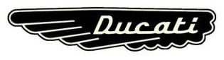   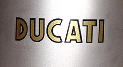  |
|
|
|
|
Logged
|
...Sydmonster - down under
Contact me about your mods and what Street Cred Points you can earn!
|
|
|
mostro-nero
New Member
Offline
Posts: 19
|
|
« Reply #14 on: November 28, 2008, 01:03:06 AM » |
|
this logo sits proudly on my monster (in my opinion it is by far the best logo)  |
|
|
|
|
Logged
|
|
|
|
|


